Bing revamped its design for Maps elements pushpins, popups and transit info. Bing expects that the new changes will make it easier for users to find information on the map, explore venues and transit information. Bing recently released a Metro app for Bing Maps on Windows 8 platform.
Pushpins are the common elements overlaid on Maps, these are revamped now along with the corresponding popup.

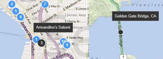
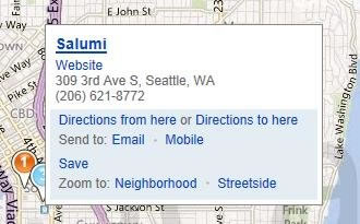
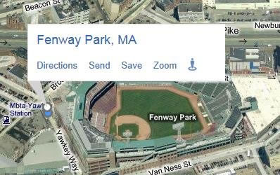
As you can see in the above image the pushpins appear as Metro styled with sleeker popups. Search related pushpins appear blue in color while user generated pushpins will look orange in color. The popups have a sleeker design with dark background and shows name of the place or location of the place while hovering over with mouse. The color of the popup changes to white while showing full content of the popups. Clicking on a pushpins reveal a large popup with more information about the place or business.


The pushpins and popups adjust dynamically based on the current map style to ensure the visibility of the information.
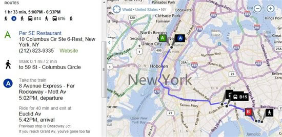
Transit information for both US and UK transport is also improved to make it easier to get directions on the transit. The colors and signage of the lines in maps changed accordingly to better reflect the actual colors used by the line both for US and UK markets.

Sharing options were also enhanced with the ability to send directions to your mobile via SMS to support transit directions. You will receive a link that will open m.bing.com, it works in all mobiles that can access m.bing.com except Windows Phone.
Source: Bing Blog
