Windows 8 Metro style is heading to more Microsoft products, new screenshots emerged over the weekend show that Windows Live web services are also getting a touch of Metro UI. Metro is the most talked feature since Windows 8 consumer preview is released.
Whether you love it or hate it, Metro is not going anywhere in fact it is making it’s way into more Microsoft products. It is already available in Windows 8, Xbox and Windows Phone and is a matter of time before it’s presence is felt everywhere.
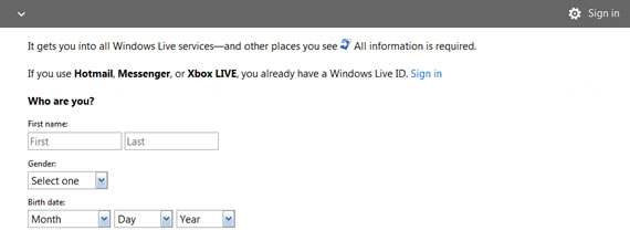
A Brazilian site Technoblog.net posted some screenshots of the next version of Windows Live web services user interface.

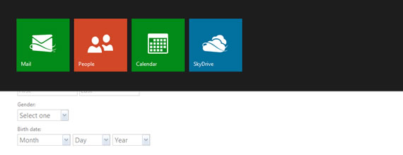
In the first screenshot there is a minimal header with a small arrow, clicking on that will reveal a metro styled box menu showing links for Mail, People, Calendar and SkyDrive. LiveSide obtained English screenshots of the same, embedded here. Tecnoblog notes that the design might be in the early stages of development, the navigation is not smooth, some clunky design elements are still there.

LiveSide found that there is an opening for an UX designer on Microsoft careers website, to design “next generation†of Windows Live Web Services. This may be an indication that the design is not yet ready and Microsoft will take some time to release it into the wild.
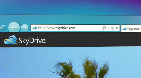
Tecnoblog also noteds, a TV commercial for IE was posted on Windows team blog last month. In that video there is a screen that shows SkyDrive new look with the black ribbon we saw in the first screenshot.

The new UI of Windows Live web service is touch-friendly, this is necessary to provide a consistent user experience along with Windows 8, as the later is designed for touch-screen tablets. What do you think of the new UI?, do you like the Metro everywhere or not?.

[…] Dropbox offers 2GB of free space, Box and iCloud offer 5GB of free space, while Microsoft’s Skydrive offers 25GB of free space. Dropbox and Box offer more storage through various […]