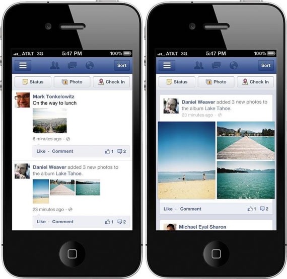
Facebook unveiled a redesign today to its mobile site as well as to its mobile apps for Android and iOS. The new design makes use of the small screen estate well, all posts will fill the mobile screen from edge to edge.
The new design also makes photos 3 times larger making it easy to view the photos as they stretch from one end to the other end of the screen. Earlier photos are displayed as small thumbnails and you need to open them to see clearly. With the new design you can see single photos in full screen something like Instagram photo views. Facebook might have inspired from Instagram design which it acquired recently.

News feed items now display as individual boxes unlike before, they use to display in a continuous stream. This new design is much nicer and clear on mobile devices, but Facebook users are not happy as you can see from the comments on the Facebook announcement thread. Open Facebook from Android or iPhone to see the new look, or go to m.facebook.com from your mobile browser.

[…] by Ram Facebook is making a redesign of the news feed to make photos appear larger and better. Facebook introduced a redesigned mobile interface recently that included bigger photos using the complete screen estate and also showing more photos […]