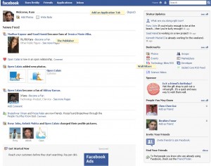
 Facebook launched a redesign of the profile pages, the new design looks clean and clutter free. The new interface is live for some users, if you don’t see the new interface you can access at new.facebook.com
The biggest change is the content stream combining status updates, wall posts and news feed items. Applications are pushed from the front page, they can be accessed from the right sidebar or there is a tab on the navigation bar from there you can access your applications. The profile pages looks similar to friendfeed content stream and on top there is message box to post your status message, the box seems to be inspired from Twitter. More at Inside Facebook, All Facebook

Overall the redesign looks clean and easy to navigate. What do you think?

The new design looks better and uses the complete width of page.
The new design is great. It looks very neat and uncluttered. I liked that they separated the application boxes into another tab
@Nirmal, Madhur
This new design looks great