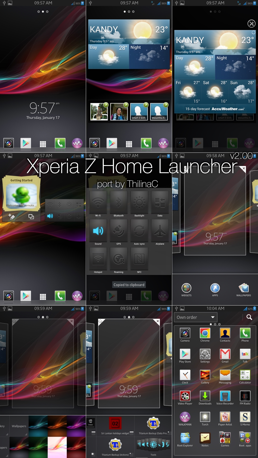
Xperia Z is possibly the best smartphone unveiled in 2013 and it features a stunning design along with an updated TimeScape user interface. Announced at CES 2013, Xperia Z is currently the talking point in the smartphones industry as it is packed with the best features you can get. Previously, Sony Xperia launchers have been good but they lacked the 3D interface like Samsung’s TouchWiz or HTC Sense. The launcher on the Xperia S,T and V is flat when swiping between the homescreens, however, the Xperia Z will be coming out with an updated launcher with a 3D user interface. Developers at XDA have finally released the Xperia Z launcher for several Android devices and the launcher looks good and is quite smooth.

Previously the launcher was ported only for Samsung devices but a full port is now available for all android devices running ICS or JB. The launcher brings all the classic Xperia features including widgets. The weather widget is beautiful and can be expanded directly from the homescreen. The expandable settings widget is also available which gives access to different types of settings.
The App Drawer has changed compared to the previous Xperia smartphones and a transparent white background comes up along with the apps. For Xhdpi, you get the 6×4 app drawer and for Hdpi, you get 5×4 app drawer. Also, you can arrange the apps by recently installed, custom order or alphabetically. Adding and removing additional homescreens is also a new feature on the launcher. Widgets can also be resized on the homescreen and you can create folders on, both, home and in the app drawer. Overall, everything is changed on the new Xperia Z launcher while keeping the most liked features on the previous Xperia launchers. The interface for adding widgets and shortcuts has also changed.
You can download the flashable zip files using this link. Make sure that you create a Nandroid backup before flashing the file in CWM Recovery. The Xperia Z stock wallpapers can be downloaded using this link.
