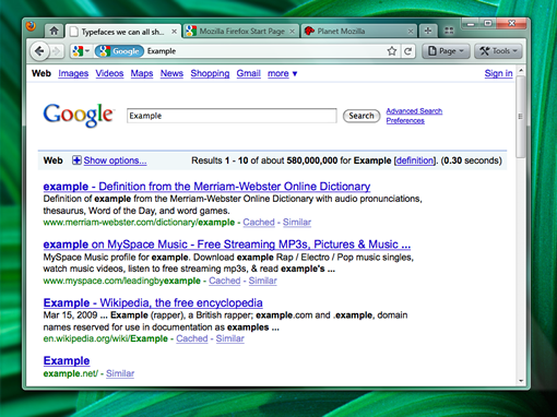
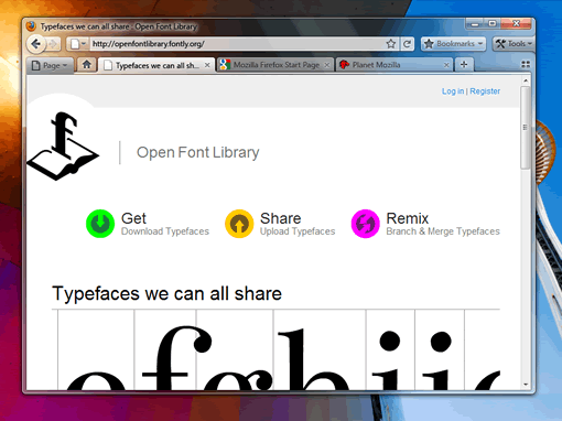
Mozilla folks released some interface designs for the upcoming release Firefox 4. One of the mockup design looks a lot like the Google Chrome browser with the tabs-on-top interface.

File menu on top of the browser is also gone, IE has long removed the file menu on top and Google Chrome also doesn’t have this. I don’t know how many of you use the File menu unless you want to print a page for that you could use “Ctrl+P” shortcut.

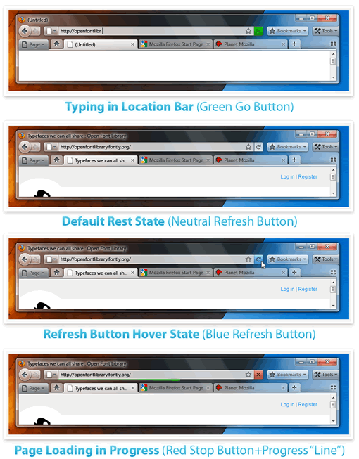
Another change is that Stop, Refresh and Go buttons are clubbed together to save some space.

These are just mockups for the Firefox 4, so you may or may not see all these changes in Firefox 4 when they release it.

who gives a shit? my FF3 is already fully customized with left side tabs, tons of plugins and dev tools.
Righini, this is radically different in it’s base and doesn’t require 4 or 6 plugins chomping memory to get it to look like that, which is why I give a shit. I think this new design is great, Chrome-ish in nature and I don’t criticise them for that – it’s a good interface, really maximises workspace, simplified for 90% of the browsing you do and you can still get to menus easily for advanced shit. I like it.
i like both idea’s, but prefere second one with tabs on bottom and bookmarks tab etc, like the layout looks well nice
bring on Firefox 4
looks cool. i’m more interested in the css3/html5 support.
@righini – trying to keep a more positive view on things may benefit you.
Bearing in mind that html5 is a standard feature of Firefox 3.5 (http://www.xul.fr/en/html5/firefox-3.5.php) then it should definitely be included within 4, hopefully improved as well.
In regards to css3 I don’t know.