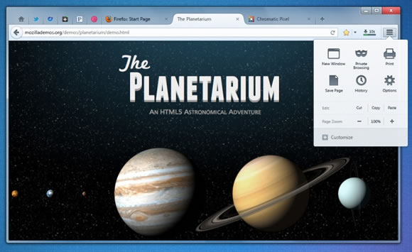
Mozilla is working on a new design for Firefox, mockups of the new design were posted to Mozilla Wiki. The mockups reveal new design and new features that are coming to Firefox in the near future. These are mockups, so we are not sure if this design makes it to the Firefox final builds or not.
The new design gets rid of the orange Firefox menu button that was introduced in Firefox 4 to replace the classic menu bar. A slick menu option is now introduced that sits in the toolbar at the same place as Google Chrome wrench menu. Now the Menu doesn’t have fixed items, it can be customized according to the user needs. Mockups show that you can add or remove buttons to the menu item. The menu can either list menu or grid menu depending on the user arrangement.


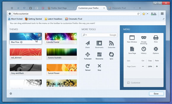
Customization Tab of Firefox Shows menu Elements and Themes
The customization options open in a new tab in Firefox, you can edit the menu item here. Firefox themes are can also be activated from this page to change the look of the browser. Search box is also included in this page and can be dragged to place it conveniently. As Firefox is moving to single address bar like Chrome, this might be a choice for users who want to have a search box.
Another interesting feature is the translation of web pages, Google Chrome already does this. Firefox might add this feature, unlike Chrome, Firefox will also translate parts of text in a page not only entire web pages.
Overall the new design looks slick and interesting, what do you think of the new design?.
