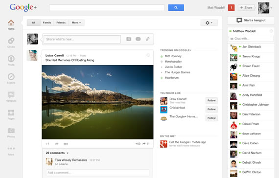
Google announced a major redesign for the Google+ service that brings lot of changes. The redesign introduces, a customizable navigation ribbon with drag and drop functionality for apps, “full bleed” of photos and videos along with new place for Google+ hangouts.
The redesign includes a new navigation ribbon on the left side of the window instead of the static top menu. The navigation menu allows you to customize the way you want, it is the place for future apps also. It allows you to drag and drop elements, show or hide certain apps. It will show quick actions for the apps when you hover on apps.
To make sharing and conversations as easy as possible Google introduced some updates, including “full bleed” of photos and videos, a new feature Google terms as “Cards” will make it easier to scan and join discussions. An activity drawer that highlights the activity around your content on Google+.

A new home for Google+ hangouts (video chat with upto nine people) announced, that will show always updated list of invitations from your friends circle, quick access to public hangouts like live broadcasts. It will also have a rotating billboard of popular hangouts, pro tips and other things.
Apart from these updates there are some nifty features also included like a new explore page that shows what’s interesting and trending across the Google+ network. A new profile with much bigger photos and more.
The features are not updated to everyone, they are being rolled out to everyone in a couple of days, in typical Google fashion.
Source: Google Blog

[…] will be released in the next few weeks. Google recently released updated UI for the web version of Google+ with much simpler interface and full bleed of photos, to align with this design changes came to the mobile app today. The […]