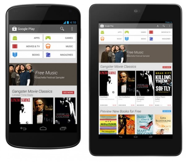
Few weeks back a leak suggested Google Play app redesign that is completely different than what we have till now. Google today confirmed that they are rolling out the redesigned Google Play App interface to Android smartphones and tablets, the rollout started today to Android 2.2 Froyo and up.

Michael Siliski, group product manager for Google Play wrote on Android blog that the redesigned Google Play Store is simple, clean and most importantly helps you to find content fast. The redesign is similar to the Google Now Cards style or Pinterest style, the earlier dark theme of Google Play is now gone. From the blogpost it appears that they have added a continuous scroll to give recommendations and to show related content. Checkout process also revamped to simplify the buying content from the Google Play store.
The redesigned app rollout started today and it might take few weeks before it reaches you. The update is available to Android devices running Android 2.2 Froyo and up.
Via Android Blog
