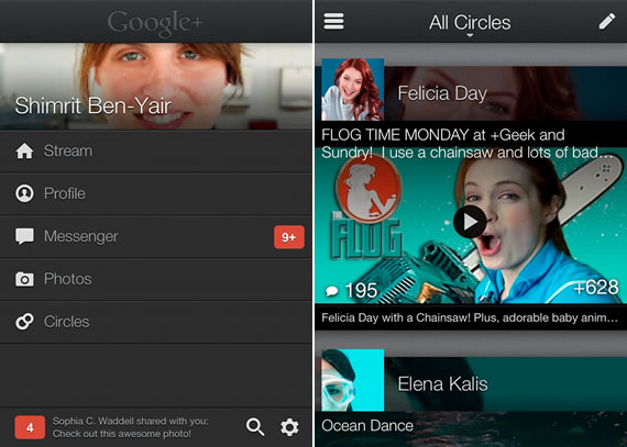
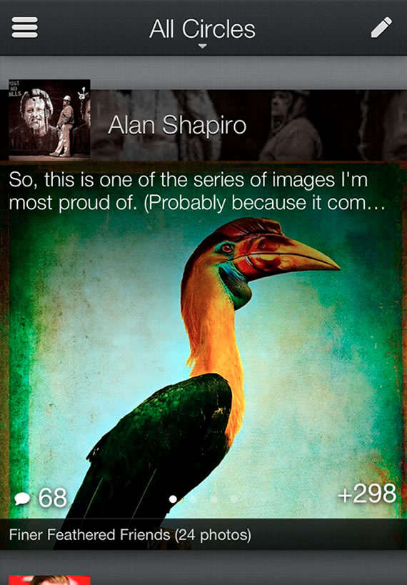
Google released today a redesigned Google+ iPhone app, the app comes with revamped UI. Google choose to release iPhone app first this time instead of Android app for Google+, the redesigned Android app will be released in the next few weeks.
Google recently released updated UI for the web version of Google+ with much simpler interface and full bleed of photos, to align with this design changes came to the mobile app today. The previous app looked like a wrapper around the Google+ mobile version, but the new app brings some nice changes, Google puts this redesign as “A feast for the eyes.”

we’re not interested in a mobile or social experience that’s just smaller. We’re embracing the sensor-rich smartphone (with its touchable screen and high-density display), and transforming Google+ into something more intimate, and more expressive. Today’s new iPhone app is an important step in this direction—toward a simpler, more beautiful Google.
What’s new in this update:
- Whether you post photos or articles or text, we’re making ‘em look good
- We’re adding crisper fonts, larger profile pics and a friendlier homescreen
- We’re making the stream easier to scan, and easier on the eyes with overlays, gradients and other visual elements
- Conversations fall into view as you move forward and backward in time
- Optical cues help the mind linger on individual posts
- Important actions like +1 now float atop the stream, making it easy to endorse all your favorites
If you use Google+ on iOS you can download the app (version 2.0.0.5888) from the app store to see the changes yourself. Android app will come in the next few weeks, Google teases that Android app will have few more surprises than what it released today for iPhone. Google is continuously adding features to Google+ or integrating it in other Google products to win users from Facebook, how far Google will be successful in establishing Google+ as Facebook alternative is to be seen.

