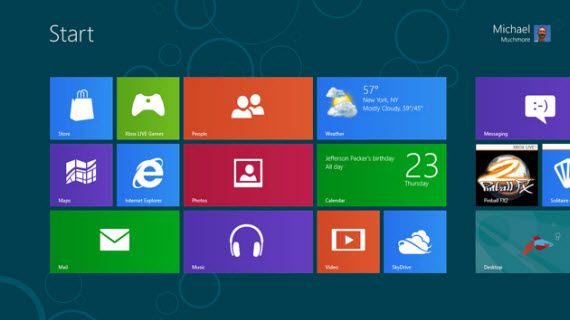
Microsoft is about to rebrand it’s Metro user interface in Windows 8 with something new, rumors appeared last week. Metro term is used to describe the design language that is users in Windows 8, from start screen to the apps that are designed to work in Windows 8.

Metro term became popular already and everybody is referencing it for describing the radical changes introduced in the Windows 8 OS. Microsoft’s decision to change the term is due to a trademark issue, if the rumors are to be believed. There were reports earlier that Microsoft will simply call the Metro interface as Windows 8 interface, but this is going to confuse customers. Another report from The Verge highlights that Microsoft might be using the term “Modern UI Style” to refer the Metro Style and “Modern UI Applications” to refer Metro Style Applications.
The reference for the Modern UI Style came from Microsoft’s event pages, for example in this listing Microsoft is clearly calling Metro as “Modern UI Style”.
Windows 8 is Windows re-imagined. Join this session to learn about the new platform for building Modern UI-style applications.
Windows 8 marks the next step in the evolution of the Modern UI design style. Through the bold use of color, typography, and motion, Modern UI design style represents a fresh approach to the user experience. In this talk, you’ll learn the design principles behind Modern UI and get insights into how to apply these principles to your own apps.
There are other references where Microsoft is using Modern UI in place of Metro, for example this post on MSDN blogs, and this event listing.
In my opinion calling it Modern UI Style is much better than calling it simply Windows 8 interface as it causes confusion and doesn’t really convey the message. Also Windows Phone 7 has Metro elements and calling Windows 8 interface in Windows Phone 7 is just silly. What do you think about the change.?
