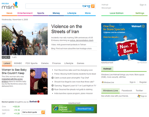
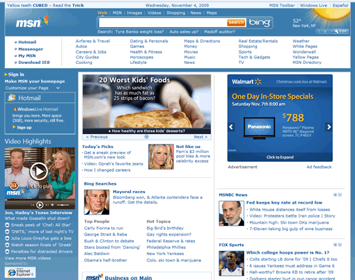
Microsoft today announced a redesign for its popular portal MSN, the most significant redesign came after a decade Microsoft says. The new home page looks clean, uncluttered and with lot of white space around. MSN is visited by 600 million people worldwide and 100 million people in US every month.
Along with the refreshing look MSN also redesigned its logo. The design is not yet live for everyone, they will rollout to users in next few weeks, and becomes widely available in the US early next year. The redesigned home page can be viewed at preview.msn.com.
The new redesign brings some new features like deeper Bing integration, Facebook and Twitter access through the home page among other things. To remove the clutter Microsoft reduced the number of links in the home page 50%.
The new home page also incorporates local information. MSN local edition provides latest information on local weather, news, sports, entertainment and other things grouped by ZIP code.
MSN new home page

MSN current home page

Microsoft Press Release
Features:
Innovative search technology from Bing: Deeper Bing integration on the new home page helps people make faster and more informed decisions and easily find the information they want from anywhere on the Web. Bing is deeply integrated as the core search service throughout the home page via key areas such as shopping, travel and local, and as a way of highlighting hot topics, trends or people.
Information and news people care about: The new home page delivers against the No. 1 customer request — simplicity and ease of use — through its fresh design and smart categorization. In-line high-quality, top news and hot entertainment from trustworthy sources such as MSNBC, FOX Sports, Hulu and Hearst, and comprehensive local information provide a compelling one-stop shop for people to use as their home base online. More in-depth local information is offered on the new MSN Local Edition, which is the only local online source that smartly combines media with Bing search and provides access to real-time community news that is grouped by ZIP code.
Convenient ways to communicate: Simplicity drove the clean integration of popular social networks, such as Facebook, Twitter and Windows Live “What’s New,†which aggregates up to 50 Web activities, including Yelp, Flickr, Pandora and more, onto the MSN home page. People no longer have to jump from site to site to update their status, tweets or see what their friends are up to; the new home page makes it easy to view and update in-line.

I hate to deflate your overinflated egos, but this is identical a disaster to yahoo’s!
So much for my premium service right?
You wouldn’t do ANYTHING bad now would you?
NOoooo…not you!
never!
Like hack my system and destroy the harddrive?
Or, keep me from being able to sign in….as it only takes about 15 minutes now anyway!
Mildly put, the homepage is really crappy!
( and I’m being really nice!)
Leave the page alone, stop fixing what is NOT broken….
Or, lose a lot of suscribers to MSN…!
Easy choice.
William, I totally agree with you. This new MSN home page is horrible, and I don’t like it! Shouldn’t have been changed, crap & just horrible!!
The new look SUX!!! and takes forever to load up. Time for new home page I guess.
I HATE the new msn homepage!!! I hate that its white and you cant change it, I hate the lay out, i hate everything about it. I even tried making a my msn page but thats just as bad. Im changing my home page to something else for the first time in 8 years. Way to screw up a good thing!
Hate the new homepage pleases give customers the option of keeping the old homepage if not yahoo will be my new homepage.
Old MSN homepage link below. Make sure to change it to your homepage settings. Tools>Internet Options> “use current” All site are monitored for traffic so Microsoft just might get the message that people don’t care for their version of “New Coke”. Link below.
http://msnmember.msn.com/
It is really is awful….. The old was more attractive looking, easier too. Why do they try to fix what is not broken,reminds me of Coco Cola when they tried to fix was wasn’t broken… Do these people have nothing to do but figure out ways to change things just for the heck of it
This new page is boring,not customizable and plain. I believe a Webpage
beginner could have done better. This is a prime example of why we had Windows 3.1,95,98,Nt 4.0,New Millenium,Win2000,WinXP,Vista and now 7 whats next Microsoft?
Junky looking….too much clutter. This is not progress. Guess we now have teenagers designing the page. No insult intended, but must be someone with a low degree of design and common sense.Sometimes in life things can not be improved upon.
i hate the new page. when i first saw it i actually thought that the page was failing and the older version had taken over.
EPIC FAIL!!! MSN! EPIC FAIL
I HATE the new MSN home page. Go back to the old one, if not I WILL change my home page to someone else!!!!!!!!!!!!!!!!!!!!!!
it is so boring,and not organized. i walked into my office this week and i thought it was a joke or something . so i tried to download it again, and this same crap comes up.
the new homepage is the worst
i will be changing my homepage to foxnews
I don’t like the new MSN homepage…..please change it back to the way it was.
We hate the new home page, not user friendly, put back to the previous layout.
I absolutely hate it and I loved the old MSN homepage. It looks like a page for a gossip column. It’s not easy to use and it’s not easy on the eyes. If anyone can reccommend a page that was like MSN’S old one, I’d love to know.
I can’t believe they didn’t listen to many of us, I sent in lot’s of feedback when it was in beta and luckily could still switch to the old version, now it looks like I can’t. Unbelievable that they messed up a good thing.
Please go back to old MSN Homepage…easier to navigate and
better arranged and eaiser to read.
New homepage is down right horrible!!!!
totally one big mass of confusion!!
IT SUCKS!!!!